Chrome-Plated Turd
I’ve switched to Firefox on both desktop and mobile. Opened up Chrome to test a project, was greeted by this lovely home page, and the dogs started barking in my head.
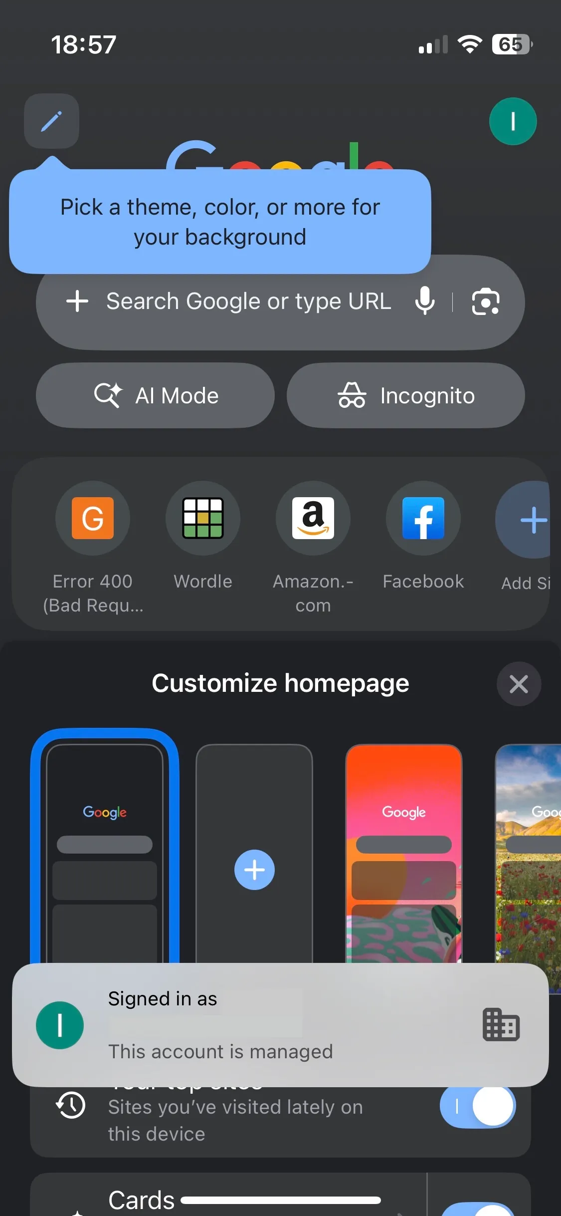
We have “Enshittification” and “Dickovers”. I need to workshop a word for this sad melange of shit. I have a lot of thoughts when I see tasteless and confused things like this from Tech. What is the structure of the company that put this shit out into the world? Are teams allowed to talk to each other? Who okayed this? What are the incentives of the people who lead teams that produce something like this? Do they have launch parties? Are they genuinely proud of shipping ‘experiences’ like these?
Do they use their own products? Are they as sad and frustrated when they do? Do they ever talk to their users? Do they see them try and use their products? Do they review and discuss the feedback? Are they incentivized to give a shit? Does it end completely at shareholders and salaries?
Is anyone at any level at the company empowered to say What the actual fuck is this?
Here it is as a Mondrian piece, courtesy of Google Gemini.

Deep breaths.