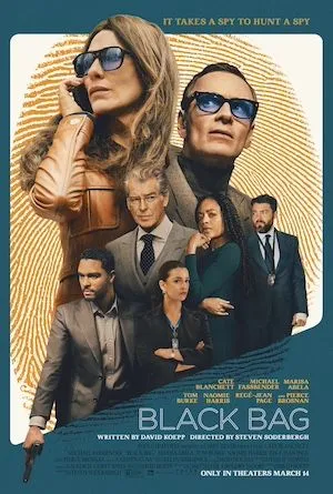
Stylish and polished spy caper from Soderbergh and Company. Not a single wasted moment: witty, engaging, lavish, taut, nothing more, nothing less. About as lean and efficient as the spies it features.
The soundtrack’s by David Holmes, a longtime collaborator (did the Oceans trilogy with him, for example). At just 28 minutes, it’s as brief and engrossing as the movie.
I did wonder how most characters managed to look ridiculously dapper and live and work in spacious and sumptuously furnished homes and offices on their government salaries.
The typeface used in the poster and titles is Aristotelica, a “rounded geometric sans” that, like all other elements (soundtrack, locations, pacing), just fits the movie as well as Pierce Brosnan’s bespoke suits.